
Shares 2
Posted on
Shares 2 was released late last night. It's a major update to Shares that adds support 4-inch iPhone screens and a whole new design for iOS 7. It's available on the App Store right now!

Purpose
The purpose of Shares is to give you a no nonsense way to see how much you made or lost at a glance. The average session time is 14 seconds. I call that a win.
The point is to see how much you made or lost. It's for day traders that want to know every possible piece of information about a stock. Some folks on Twitter said they were interested in getting into stocks and Shares was great for trying it out. Amazing.
A Little History
I originally made Shares in a Saturday afternoon. I had just bought some Apple stock and kept using the calculator and stock widget to calculate how much I've made. This was silly. I'm a programmer. Time to program something to fix this.
The original version didn't have any assets besides the temporary app icon I made. I was pretty proud of it. It was all gradients and stuff with drawRect:.
I ended up hiring a designer to make an icon for it. The icon sparked all kinds of ideas for the interface that were super skeuomorphic, but I couldn't execute them.
My friend Josh Brewer saw my design and the icon at lunch one day and said he wanted to help. So we rocked out a whole new app with his awesome design. It took several months because we were both busy, but we finally got it done and released it April 2012.
The Update
After months and months, I finally updated it. There wasn't support for devices with 4-inch screens (like the iPhone 5) until now. People were starting to get impatient. One evening a few weeks ago, I got motivated and opened up Photoshop to see if an idea I had for it would work out. Turns out, I liked it a lot.
I ended up staying up super late that night working on it. The next day, I just rewrote Shares to use the new design. After 2 more days of perfecting it more, it was ready again.
The Icon
I was about to hire the same designer to make a new icon to fit in with iOS 7 more, but wanted to try on my own for a bit. The end result was alright, but the steps there were painful. (I made a wallpaper of the worst one.)
Most of designing an icon for iOS 7 is simplifying over and over. I made something that had tons of detail I spent hours on and realized it had to be simpler. It was really hard removing more and more but still having it keep it's shape and meaning.
Overall, I'm happy with it. I'm a little sad to see the skeuomorphism days end though. Here's the final result:
![]()
Nerdy Stuff
There's a few interesting nerdy things in Shares 2. A few folks asked about the navigation bar color. iOS desaturates the navigation bar color a lot, so it's hard to get the color you wanted. My friend Caleb Davenport had a good suggestion. If you make a HSB color instead of RGB and just set saturation to 1.0, it looks a lot better. Boom. I simply use ColorSnapper and set it to HSB mode to copy the code for the color.
I switched to NSURLSession completely. No more AFNetworking. As much as I love, AFNetworking, the 2.0 update is really painful to move to. Apple's new NSURLSession is so easy to use, I didn't see the need for it with Shares (since it only makes 1 HTTP call).
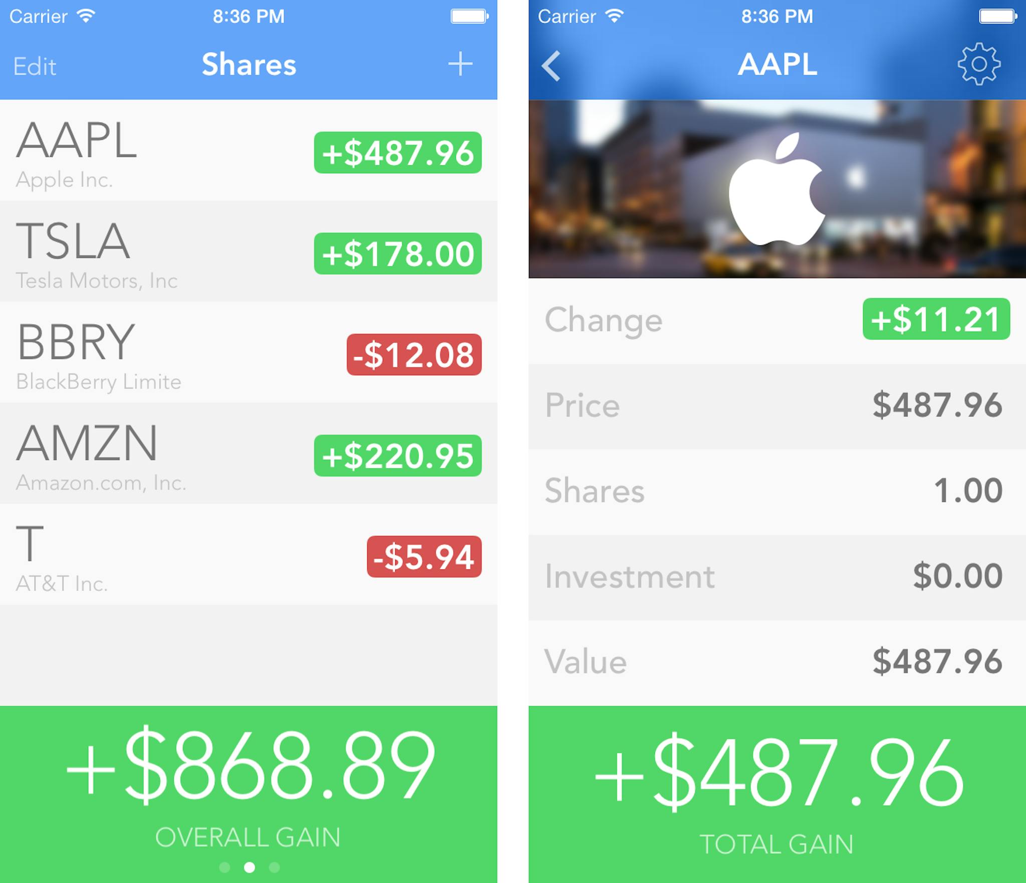
The cover photos (you can see Apple's in the screenshot above) all come from the server. None of them are in the app. There's a JSON file on S3 with a list of symbols I made artwork for. I make each of them by hand so they look good. Then it downloads them if they are missing. There's some clever stuff to predownload them if possible so hopefully users never have to wait.
They'll be more cool nerdy stuff in a future update to talk about.
Thanks
Thanks to everyone that downloaded Shares 1 and Shares 2. I am truly grateful for your support. If you haven't already, download Shares 2 and leave a review. It would mean a lot to me.